PowerPoint Tips Blog
Helping you with presenting, PowerPoint, and speaking

How do you format your slide titles?
March 13, 2023 by Ellen Finkelstein Leave a Comment

When creating a presentation, formatting your slide titles can greatly impact how your audience reads and understands the information presented. Many people default to what’s called “title case,” where each word is capitalized (with some exceptions).
However, others prefer “sentence case,” where only the first letter of the first word is capitalized.
In this post, I’ll explain why I prefer sentence case for slide titles.
Readability matters
While title case can make text look more important, it can also make it harder to read. Imagine reading an entire book in title case – it would be difficult on the eyes. This is where sentence case shines, as people can read it more fluently, which allows the audience to quickly understand each slide’s title.
Try reading this same paragraph in title case!
While Title Case Can Make Text Look More Important, It Can Also Make It Harder to Read. Imagine Reading an Entire Book in Title Case – It Would Be Difficult on the Eyes. This Is Where Sentence Case Shines, as People Can Read It More Fluently, Which Allows the Audience to Quickly Understand Each Slide’s Title.
Not pleasant, right?

Of course, slide titles aren’t that long but even so, you add a small amount of difficulty when you use title case. Across many slides, this can add up to a tiresome experience for your audience.
“A title in title case is said to have more gravitas, and it stands out as a title even without a special design being applied (bold face, large font size, etc.) Sentence case is supposed to be more casual and easier to read.” — from titlecaseconverter.com “In sentence case, the first letter of a sentence and the proper nouns capitalized. It’s considered the most readable form of text.” – from uxdesign.cc
Note about title case: There is some disagreement about exactly which words not to capitalize but everyone agrees that conjunctions and articles are not capitalized. The disagreement applies to prepositions and I follow the rule (called AP Style) that prepositions under five letters are not capitalized and above that they are. For example the word through would be capitalized. But others don’t capitalize any prepositions.
Left-justifying your titles
Another tip to help your audience smoothly read your slide titles is to left justify them. In the past, most PowerPoint themes centered slide titles by default. However, with left justification, each slide’s title always starts at the same place, making it easier for the audience to know where to start reading. While most people may not consciously notice this, it can make the process of reading slide after slide more comfortable and easier on the brain.

To left justify your titles, it’s best to use the Slide Master.
- Choose View, Slide Master.
- Scroll up to the top, larger layout.
- Click inside the slide title to select the title placeholder.
- Click the Home tab from within Slide Master view.
- In the Paragraph group, click the Align Left icon
To left justify an individual slide’s title, just click inside the title placeholder and in the Paragraph group, click the Align Left icon.
Top justification for consistency
In the same way, top justification can help ensure consistency throughout your presentation. When your titles are all the same length, it may not make much difference. However, if some are one line and others are two lines, with the default middle justification, the first line of the title will move upward and not be in the same place. By top justifying your titles, they will always start in the same place, making it easier on the eyes and the brain.
To top-justify your titles, it’s best to use the Slide Master.

- Right-click on the edge of the title placeholder and choose Format Shape from the menu that appears.
- In the Format Shape sidebar that appears, choose Text Options (1), then choose Textbox (2).
- From the Vertical Alignment drop-down, choose Top (3).
Of course, there are times when centering or right-justifying titles may be appropriate, such as for emphasis or when changing topics. However, for consistency and readability, I recommend keeping the majority of your titles left and top justified.
While title case may look more important, sentence case along with left-justified, top-justified titles can make your presentation more readable and easier to understand. By making small changes to your formatting, you can help your audience retain more information and engage with your message.
Try reformatting a presentation in this way and see if it looks better. Try it out on a real audience, too!
Leave a comment
Let me know what you’re doing now and what you think of title case vs. sentence case for slide titles.
Related posts:
- How to top or bottom align slide titles
- Add power to your message with better slide titles
- 10 steps to create a better PowerPoint theme
- 5 principles for easier and faster slide creation
Leave a Reply
Services by software
PowerPoint presentation >
Remarkable Powerpoint presentations
Keynote presentation >
Presentations in software Keynote
Google Slides presentation >
Professional Google slides presentation
ALL SERVICES
- Pitch deck design
- Google slides redesign
- Investor deck design
- Marketing Presentation
- Sales Presentation
- Keynote redesign
- PowerPoint redesign
- Prezi presentation
- Executive Presentation
- Corporate presentation
- Pitch deck redesign
- Thesis presentation
- Investor Presentation
- Presentation For Event
- Branded email designs that convert
- Corporate Overview Presentation
My availability status:
Currently accepting work
Start a project
- March 3, 2022
Creating Titles for Your PowerPoint Slides: Tips & Tricks

Written by Tom Caklos
Presentation designer

Adding titles, visible or not, to your PowerPoint slides will help you in many ways. Navigating through the presentation, structuring the content, and keeping your audience in the loop are some of the main benefits that come with working with titles.
Does every PowerPoint slide need a title?
It is highly recommended to use the title on every PowerPoint slide. While you don’t need to necessarily make them visible to your audience, it still provides a great amount of value and benefits. Having a title on every slide helps your audience to keep up with the content structure.
It also helps them to understand the topic much better. Especially if the presentation is about some study with a lot of terminology and facts.
While some people would argue with me that sometimes “less is more” – having a title on every slide will give you many benefits I already mentioned.
Another thing to keep in mind.. you don’t need to make them visible to your audience. Just keep them there so you can remind yourself where you are in the presentation. It helps a lot.
Recommendation : Check out 6 PowerPoint Design tips to learn how to improve the design of your presentations!
How do you make a good title for each slide?
When crafting titles for your slides, try to always keep in mind a bigger picture. Step back, and try to think: “What sentence would draw the best conclusion for this specific slide?” and “How it would impact the rest of my presentation” ?
Don’t make the mistake of titling your PowerPoint slides without deeper thinking. It’s essential that it makes perfect sense.
Now be careful.. while it can make perfect sense to you, your audience might not get it. So what I recommend to avoid this scenario is to always show your presentation to a few people and ask them, if they understood everything.
That way you get non-biased opinions and feedback.
The best PowerPoint slide title ideas
Some of the best titles are usually:
- Funny & Humorous
- Draw conclusion
Here are a few great examples of the best PowerPoint slide title ideas:

When crafting titles for your slides, try to draw inspiration from other presentations on the internet – so you get a better idea of what worked and what didn’t. Life is too short to make all the mistakes, so we need to start learning from the mistakes and successes of other people!
Wrapping it up
So now that you understand the importance of titling your PowerPoint slides, and what role they are having in your success – go and apply what you learned! That’s the only way to learn properly.

Thanks for reading my article! When I write, I always try to bring as much value as I can. If you're having any questions, or if you need any help, feel free to reach out to me!
Did you learn something new? Share it with your network!


Slides Count for 1 Hour Presentation – Here’s How Many Slides You Need

4 Main Differences Between Good and Bad Presentation

How much do presentation designers charge? Updated rates 2022
Let's get to work.
Oravicka 423 027 12 Vitanova Slovakia
[email protected] +421 903 958 162 Linked In
@Tom The Designer 2021
All Caps in Presentations? Don’t Rule Them Out!
By all caps we mean ALL CAPS. One of the biggest questions in text design and layout is: Why is all-caps text such a popular option for emphasizing important points in presentations?
Unfortunately, all caps are often overused – so much so, that they’ve lost a lot of their impact. But what exactly is so problematic about all caps in presentations and when can it be useful? Here are some answers.
Why the choice of the right font and font size is important
The selection of the appropriate font and typography plays a crucial role in the design of presentations. A well-chosen font not only adds aesthetics but also influences the readability and impact of the content.
When choosing a font, it is essential to opt for a clear and easily readable font that remains legible even at larger distances. Sans-serif fonts like Arial or Helvetica are often a good choice for presentations as they convey a modern and professional appearance.
Typography should be consistent and consider different font sizes and formatting for headings and body text to visually support the hierarchy of content.
Colors and contrasts also play a significant role in presentation design, especially when combined with capital letters. It is crucial that the background and font color offer sufficient contrast to ensure the text is easily readable.
Poorly chosen color combinations can hinder readability and make it challenging for the audience to grasp information quickly. It is recommended to use light text on a dark background or vice versa to achieve a clear contrast and improve readability.
Read more about finding the right font in our blog “ PowerPoint Fonts “.
All caps in PowerPoint can be problematic
In PowerPoint presentations, the font size and style should n ever distract from the content but instead, reinforce it.
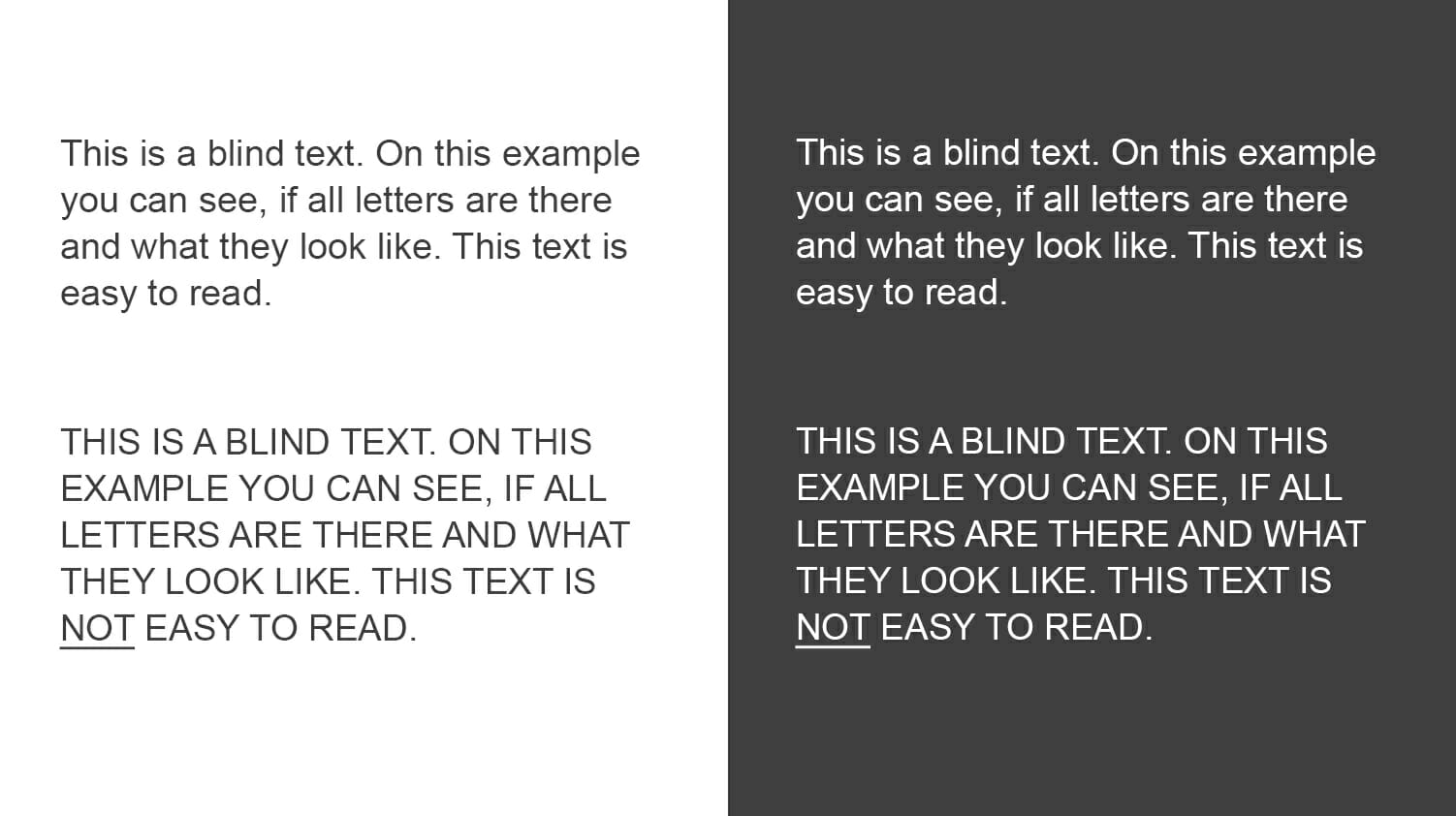
All caps can be really effective for short slide titles that introduce a topic – they help focus the audience’s attention. Never use them in longer text passages. A paragraph written in all caps is really hard to read.

The evolution of typesetting
Believe it or not, but all caps didn’t originate with social media shouting– they were first seen in the 8th century in text written in the Latin alphabet. All caps were a popular choice for newspaper headlines until the 1990s when the trend turned to lower-case letters. While all caps emphasize text (great for headlines), lower-case letters are easier to read.
Also, standard office programs, such as Word and PowerPoint, are not designed to handle all caps well, making this choice not a particularly user-friendly one .
Use all caps SPARINGLY in presentations
Think of all caps as a stylistic device that should be used in moderation and in the right places. It is an effective way to emphasize important terms or underline striking statements. In presentations, all caps should be limited to title slides and headings.
There are two main reasons why all caps should be avoided in presentations. On the one hand, all caps is the Internet equivalent of shouting. Overuse of all caps quickly comes across as aggressive or as the written equivalent of shouting. Secondly, all caps make text difficult to read .
What is the difference between all caps and small caps?
Small caps are small letters in the form of capital letters . They are traditionally used for text passages that need to be emphasized but would appear too aggressive in all caps. Many publications also use small caps for acronyms longer than three letters. Small caps generally appear more elegant and refined than all caps. They are also slightly wider than smaller capitals.
Readability is priority!
Using all caps too much in PowerPoint presentations comes at the expense of readability. First of all, ask yourself what you want to achieve with your chosen font. To make sure that your audience’s attention doesn’t stray, readability should be your first priority.
When we write text passages, we want them to flow and be easy to understand. Using all caps in text-heavy PowerPoint presentations has the opposite effect – your audience will have difficulty reading what you wrote, will take longer to get through the text and eventually, they’ll lose interest .

Capitalization in English – the basics
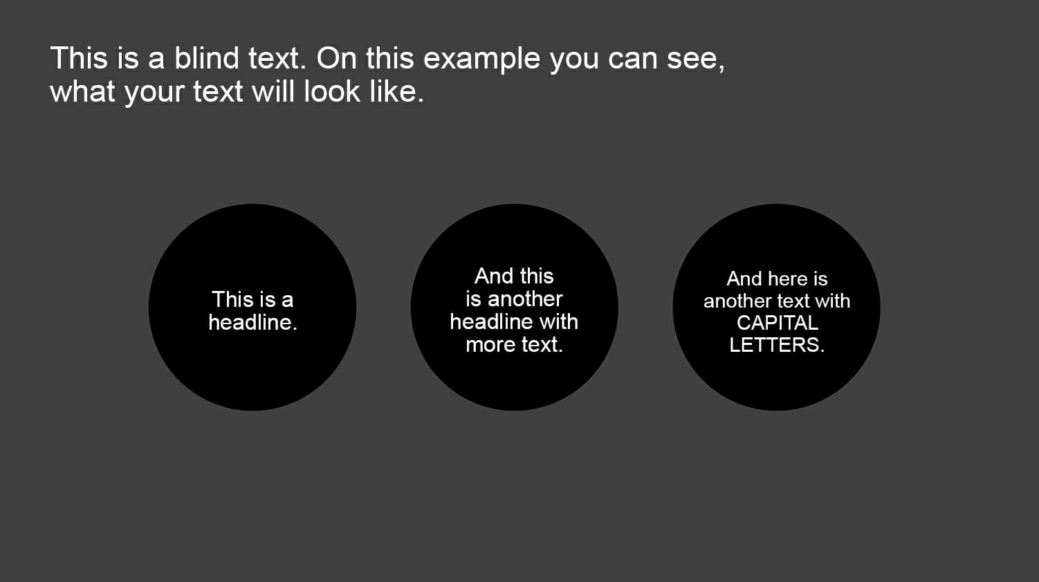
In English, words that appear at the beginning of a sentence, as well as names and proper nouns, are capitalized. Common nouns, such as process and business, as well as verbs, pronouns, conjunctions and adjectives are never capitalized. The brain is aware of these rules, making text much easier to read.
Sticking to these rules creates a comfortable flow and allows the audience to easily distinguish when a new sentence begins. Remember, your brain completes the process of recognizing words and their respective meanings within milliseconds.
Over-capitalizing words throws a wrench in this. Twist and turn it any way you like but, these basic grammar rules make text easier and faster to read.

When to use (and not use) all caps
Use all caps in PowerPoint as sparingly as you can . Using the same font size and spacing throughout your text creates a block of words that is far too homogeneous for the eye to decipher and interpret.
The disadvantages of all caps
The reader needs more time to understand the text. This is especially true if you use it for whole sentences and text passages.
- Poor legibility
- Disturbs the reading flow
- Comes across as advertising
- Convey an aggressive tone
There is an exception – slide headings
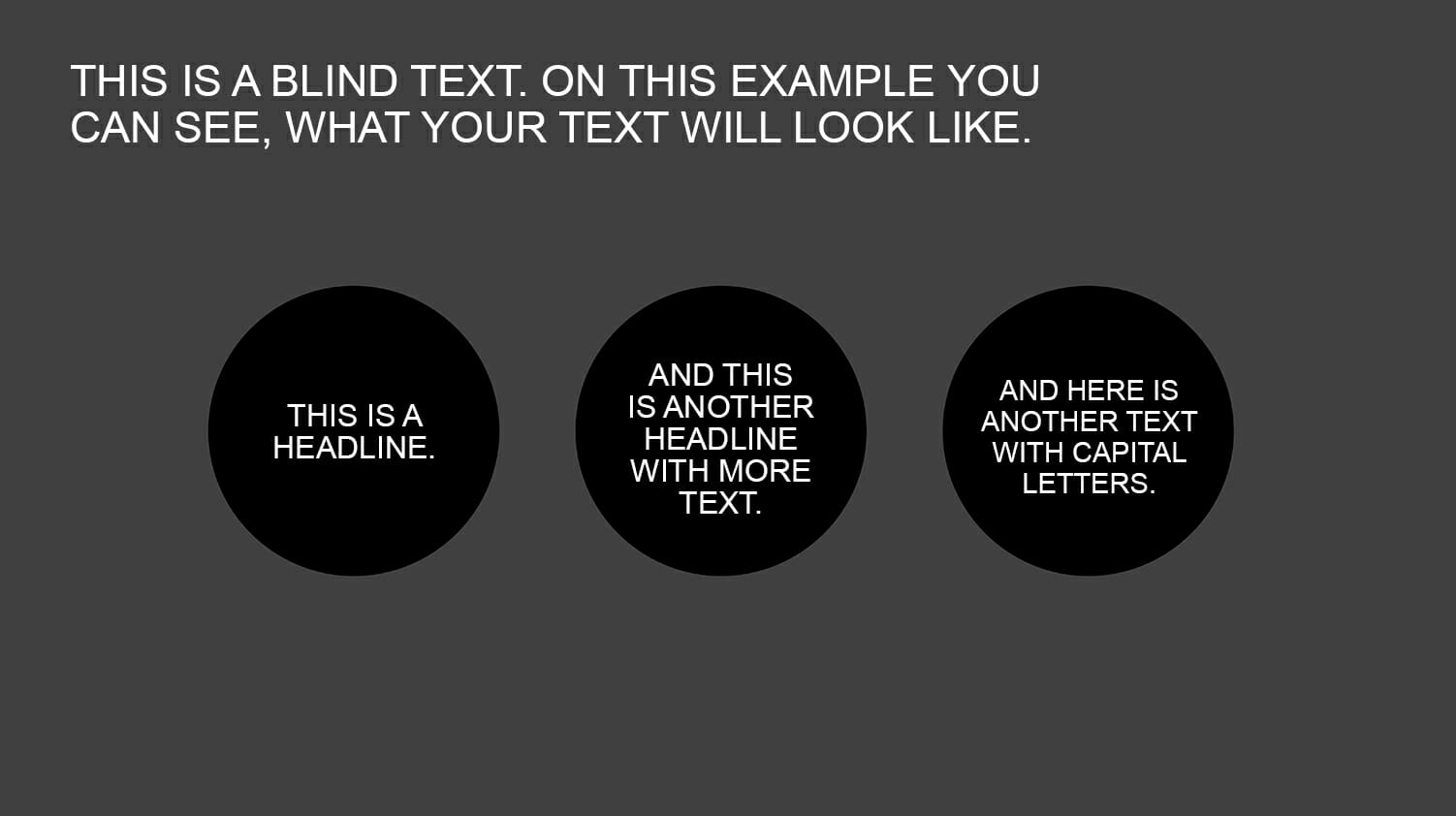
Slide or chapter headings are a special case. They should stand out from the rest of the text and, if they’re only a few words long, they won’t disrupt the reading flow. Also, each new slide should arouse the audience’s curiosity and the title of each slide is responsible for transitioning to this new topic.
In this case, the additional attention and “headline character” of all caps can have a positive effect. Just make sure to keep all-cap headings short — never longer than a few lines — otherwise they’ll lose their effect. All-cap headings can put some restrictions on the length and detail of your headings so make sure they’re a good fit with your writing style.
Alternative ideas for text highlighting
Besides capital letters, there are many other ways to emphasize important content in presentations. For instance, using shadows, borders, or highlights can visually make text elements stand out. Embedding graphics, icons, infographics, or symbols can also help effectively convey information and captivate the audience. It is important to explore creative design options to communicate messages in the presentation in an engaging and impactful manner, without compromising readability.

Conclusion: Avoid using all caps for long headings and text passages in your presentations.
Don’t make it unnecessarily difficult for your audience to read your slides. Instead, choose an elegant, modern font and size that the eye can processs quickly. Headings are an exception but here too, the use of all caps sould be considered carefully.
If you have any questions regarding capital letters or PowerPoint in general, feel free to contact us at [email protected] . We are here to assist you!
Looking for professionally designed slide templates to support your key messages? Check out our shop, where we have a wide range of slides available for download, covering various (business) topics. Browse through our selection today! ► Visit the Shop
You may also be interested in other articles:
- PowerPoint Fonts
- Embedding Fonts in PowerPoint
- PowerPoint Layout
Share this post
- share
- save

Design Thinking: Problem Solving with a Difference

Why Corporate Mission Statements Are So Important

7 Tips & Learnings from the Apple Keynote

IMAGES
VIDEO
COMMENTS
Capitalization of title slides. Title slides, the first slides in a PowerPoint deck, should always be capitalized using title case. This means that you capitalize almost all of the first letters of each word. You can use our tool to confirm which words should be capitalized.
When creating a presentation, formatting your slide titles can greatly impact how your audience reads and understands the information presented. Many people default to what's called "title case," where each word is capitalized (with some exceptions).
Unless there are house rules then broadly in any text, the exceptions to normal rules about capitalisation are titles and lists. Titles should have the same place in presentations as in books, magazines or newspapers: eg, each page or slide might have a headline. Lists are different.
Title case capitalizes each word and is what most of us were taught for slides since the default title placeholder says, “Click to add title”. All capitals was a way to add emphasis in the ...
Adding titles, visible or not, to your PowerPoint slides will help you in many ways. Navigating through the presentation, structuring the content, and keeping your audience in the loop are some of the main benefits that come with working with titles.
Capitalize My Title is an online app that applies the professional typesetting rules to title capitalization. You paste in a sentence and get back the same sentence updated to each word capitalized based on Title Case, AP/APA/Chicago/MLA style, UPPERCASE, lowercase, and more.
In PowerPoint presentations, the font size and style should never distract from the content but instead, reinforce it. All caps can be really effective for short slide titles that introduce a topic – they help focus the audience’s attention.
Build a bold PowerPoint title slide that shows your audience that you're excited to share! In this tutorial, I'll show you how to build a PowerPoint title page. You'll see intro slide examples that spark success. Attention is everything, and presentation title pages help you get and keep it. It's quick, easy, and key to success in 2024!
In the example below, each item in the list on the slide is capitalized according to a different standard. Doesn’t it look messy, disorganized, and unprofessional? By contrast, the following slide achieves optimal consistency – resulting in no hesitation on the part of the viewer or reader. Capitalization Across Headers
In a nutshell, crafting the perfect titles for your slides is an important aspect of giving a successful presentation. By following the tips outlined in this article, you can set the stage for each slide.